How To: Coordinate Colors
This summer I decided to invest in a couple of new linen shirts from an Etsy seller called LoveAndConfuse.

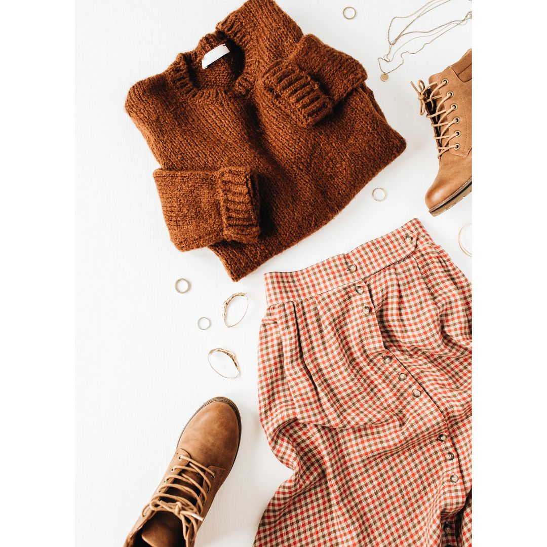
Along with a sale top I bought, the company sent along a bunch of fabric samples. This was incredibly helpful because it’s particularly important that the items of clothing (along with makeup and accessories) worn near your face are flattering, and the swatches allowed me to perform scans to determine which were a good match for my coloration. These three were the winners.

But then I saw this skirt.

And I decided to try it out, too. So how did I pick a color for the skirt from the 30 or so available options?
The first thing to note is that you don’t always need to worry about color coordination.
Any of your wardrobe basics (think denim or skirts and trousers in neutral or near-neutral colors) will generally work on the bottom when you’re dressed casually.

But I decided to choose a color that worked with my tops in case I wanted to look a little more polished.
To coordinate your clothing, choose colors that share one or more of their three dimensions.

As a reminder, every color is defined by three dimensions: value, chroma, and hue. The value is how light or dark a color is. The chroma describes how muted or intense the color is; and the hue is what you generally think of as the color, e.g., red, yellow, green, etc.
For example, let’s say you choose a purple top that matches both the value and chroma of your skin color. The first option is to select bottoms that work for you generally (so they would also fall into your palette). Here’s an example using another color that matches my skin’s value and chroma.

This works both because the skirt matches my skin’s value and chroma as well as the value and chroma of my top.
Your second option is to select bottoms in a color that just works with your top. You could match the value and chroma of your top, so another color from your rainbow, or maybe just the purple hue as I’ve done here.

This is where it begins to feel a little like magic because it isn’t quite as obvious why it works, but the pieces do work together.
Takeaway: When you want to create a polished and coordinated outfit, look for threads of similarly that run through both your fixed colors (those of your skin and hair) and those you select on top and then another thread that pulls together what you’re wearing on top with what you’ll have on the bottom.